Adtran
Brand identity
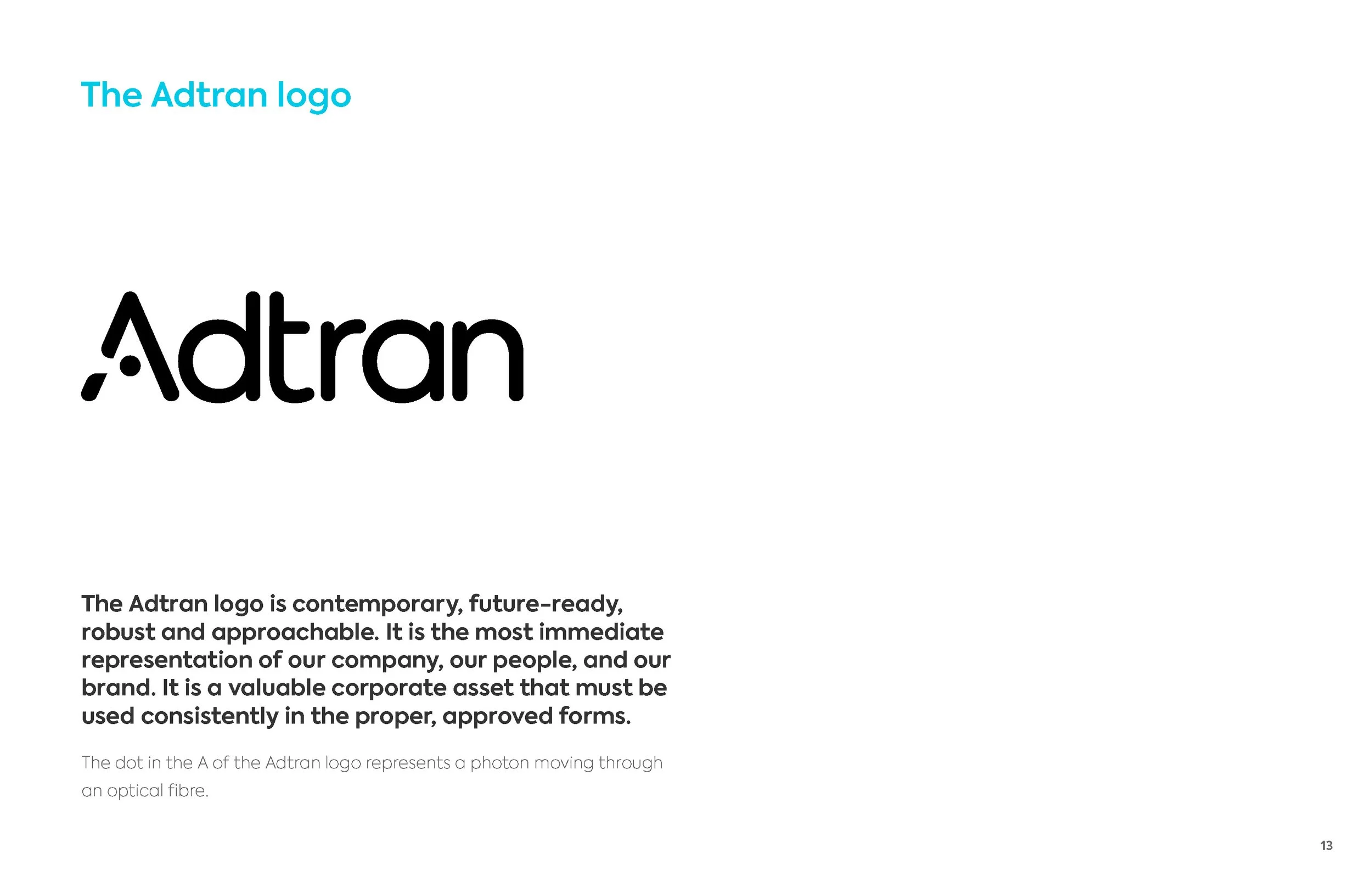
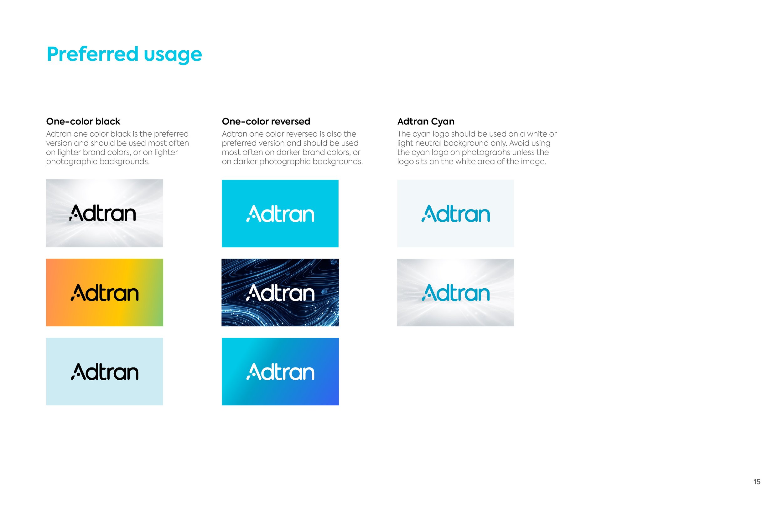
Logo design
Brand guidelines
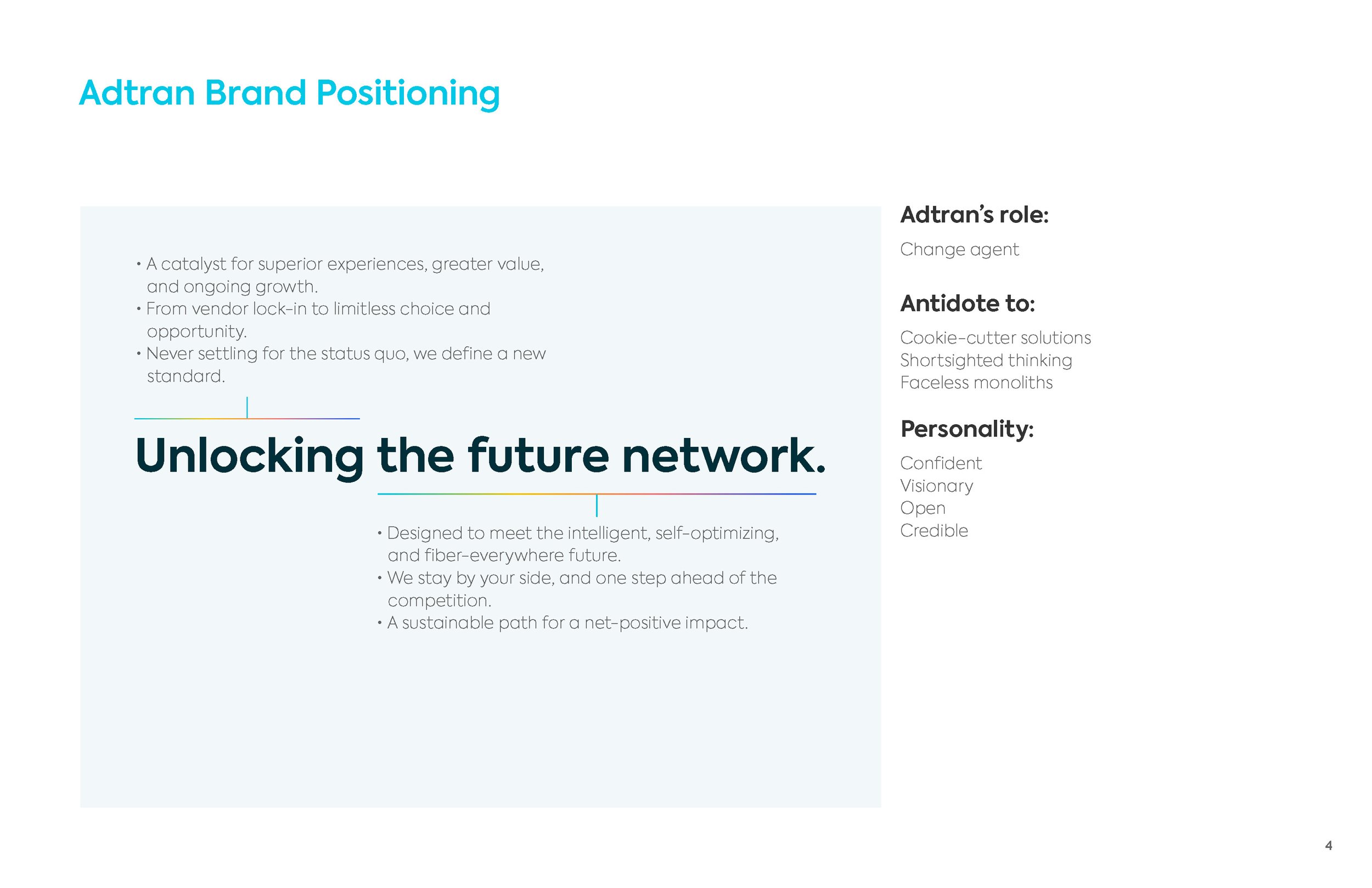
Adtran is a legacy broadband company that needed an updated branding and messaging as it transitioned to a fiber-everywhere world. We designed a new identity to meet the intelligent, self-optimizing, and fiber-everywhere future. The dot in the A of the Adtran logo represents a photon moving through an optical fibre and the color spectrum gradient respresents fibre optic light.