intercom
Brand refresh + guidelines
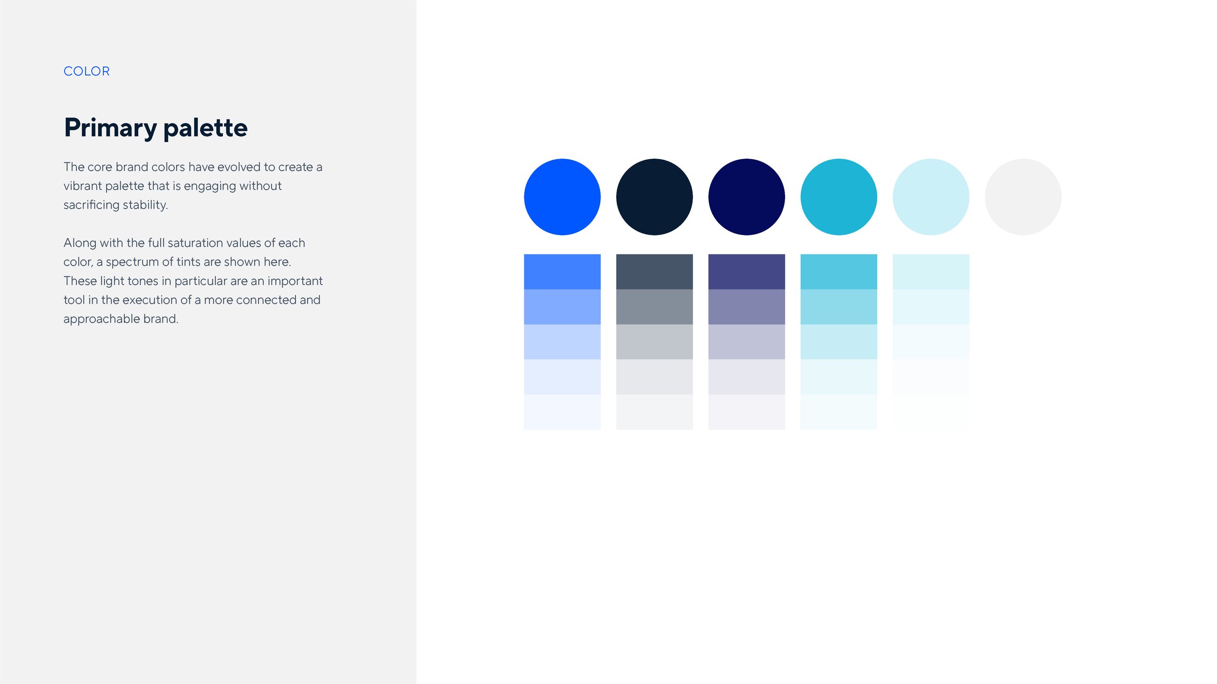
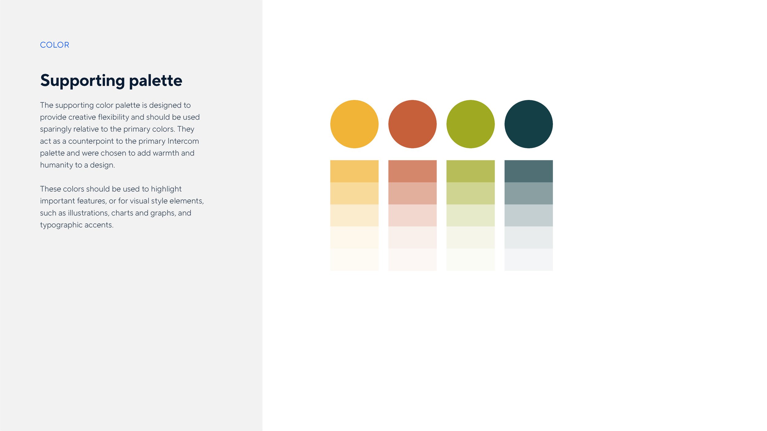
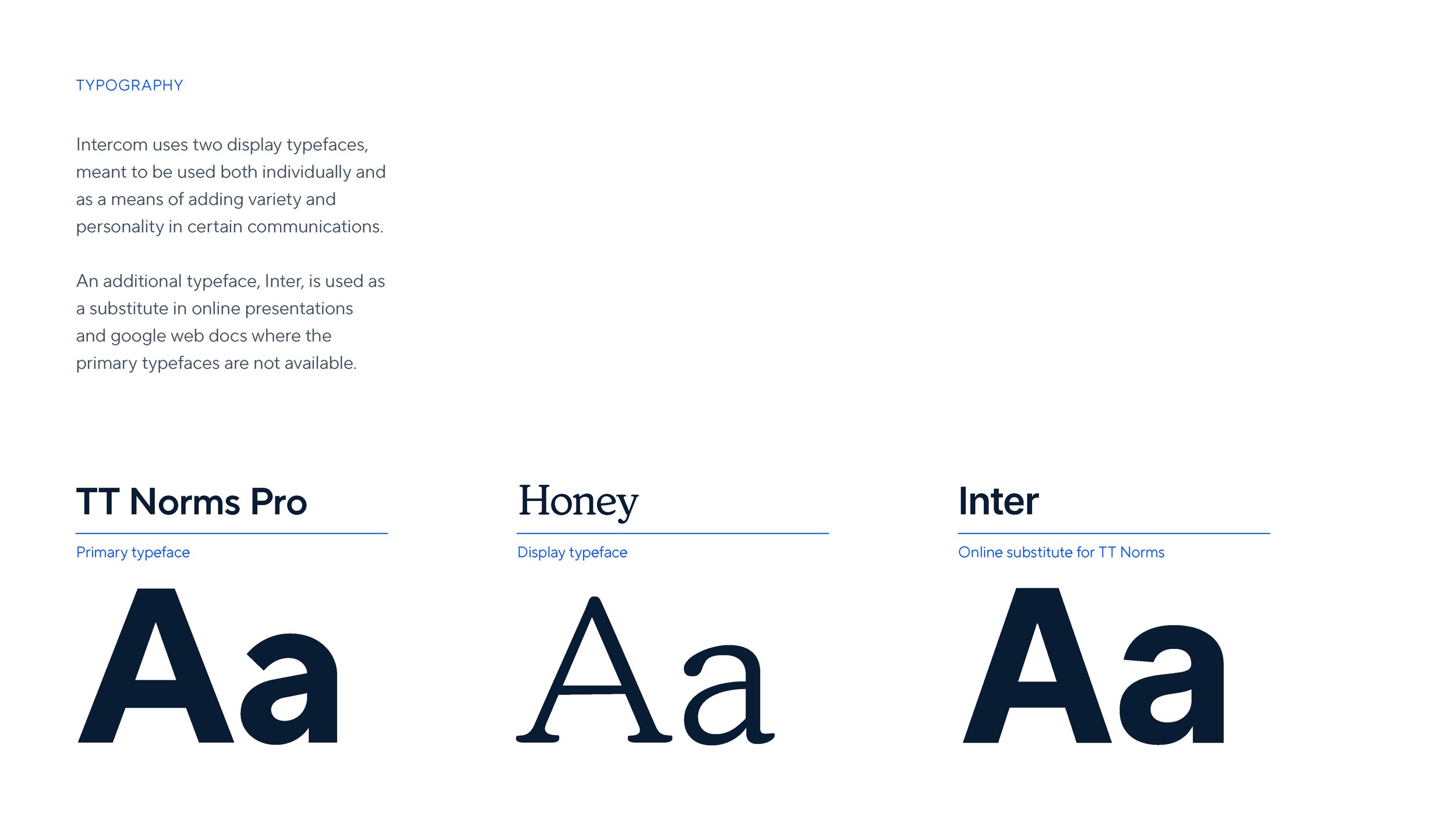
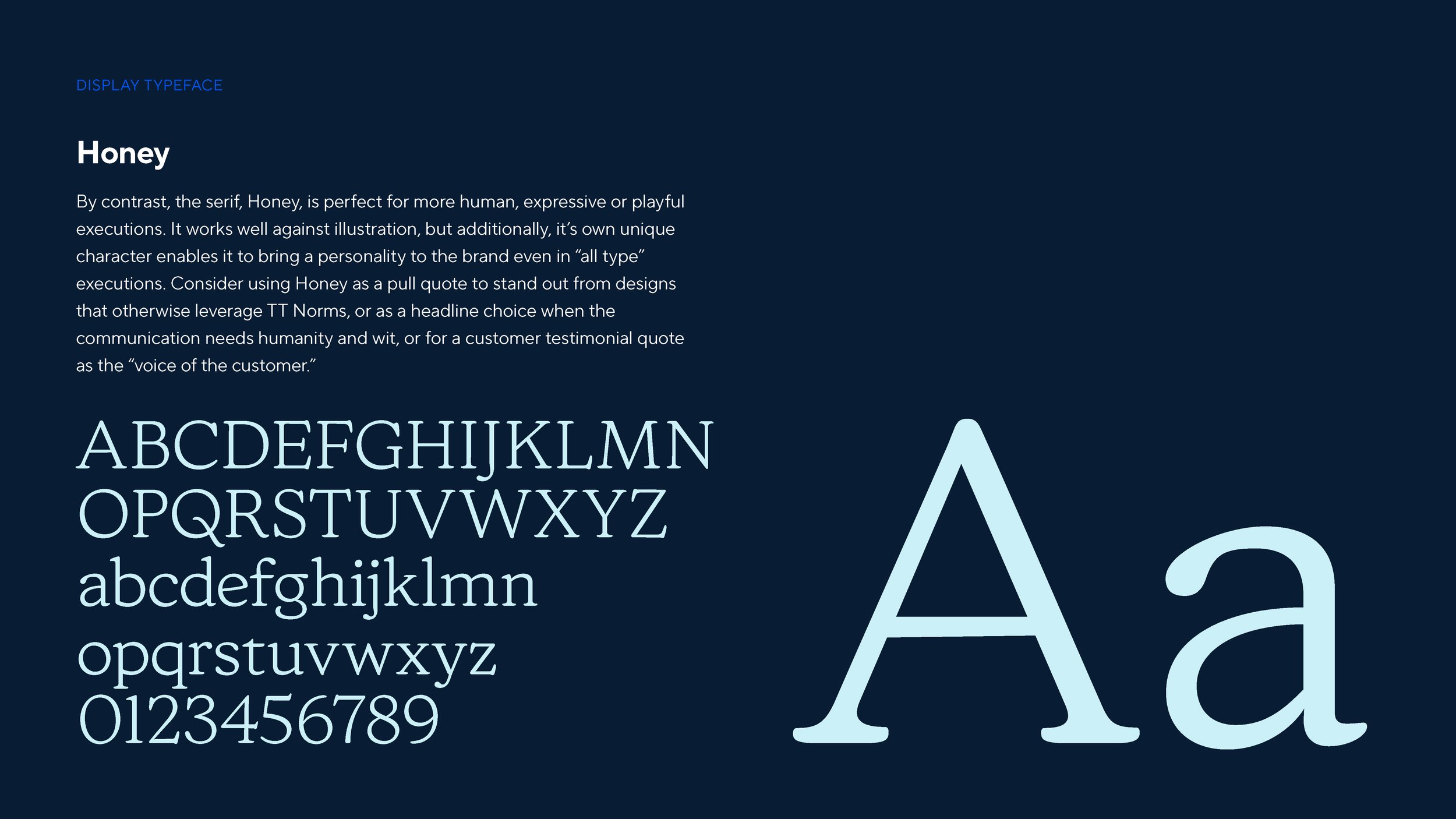
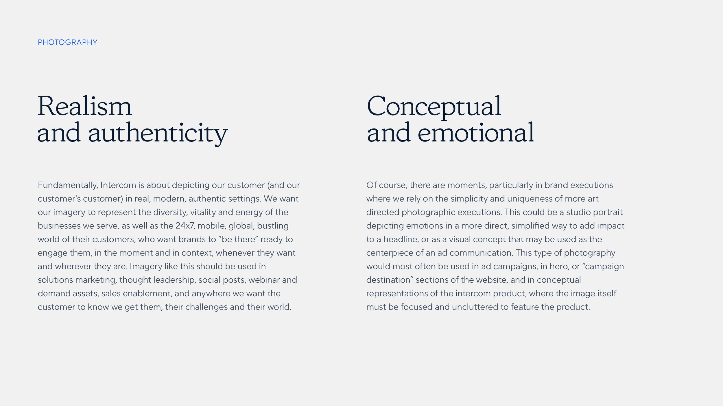
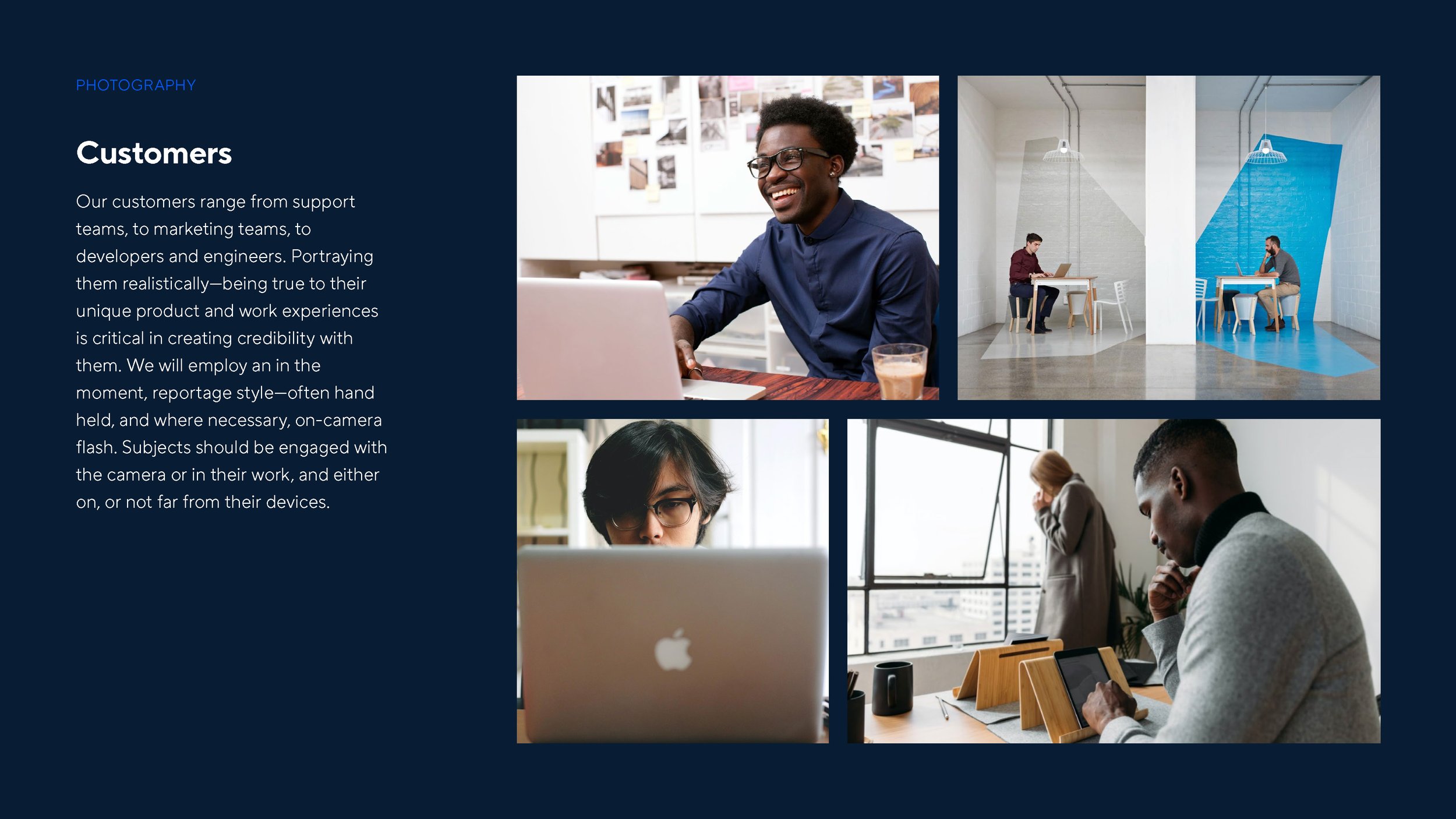
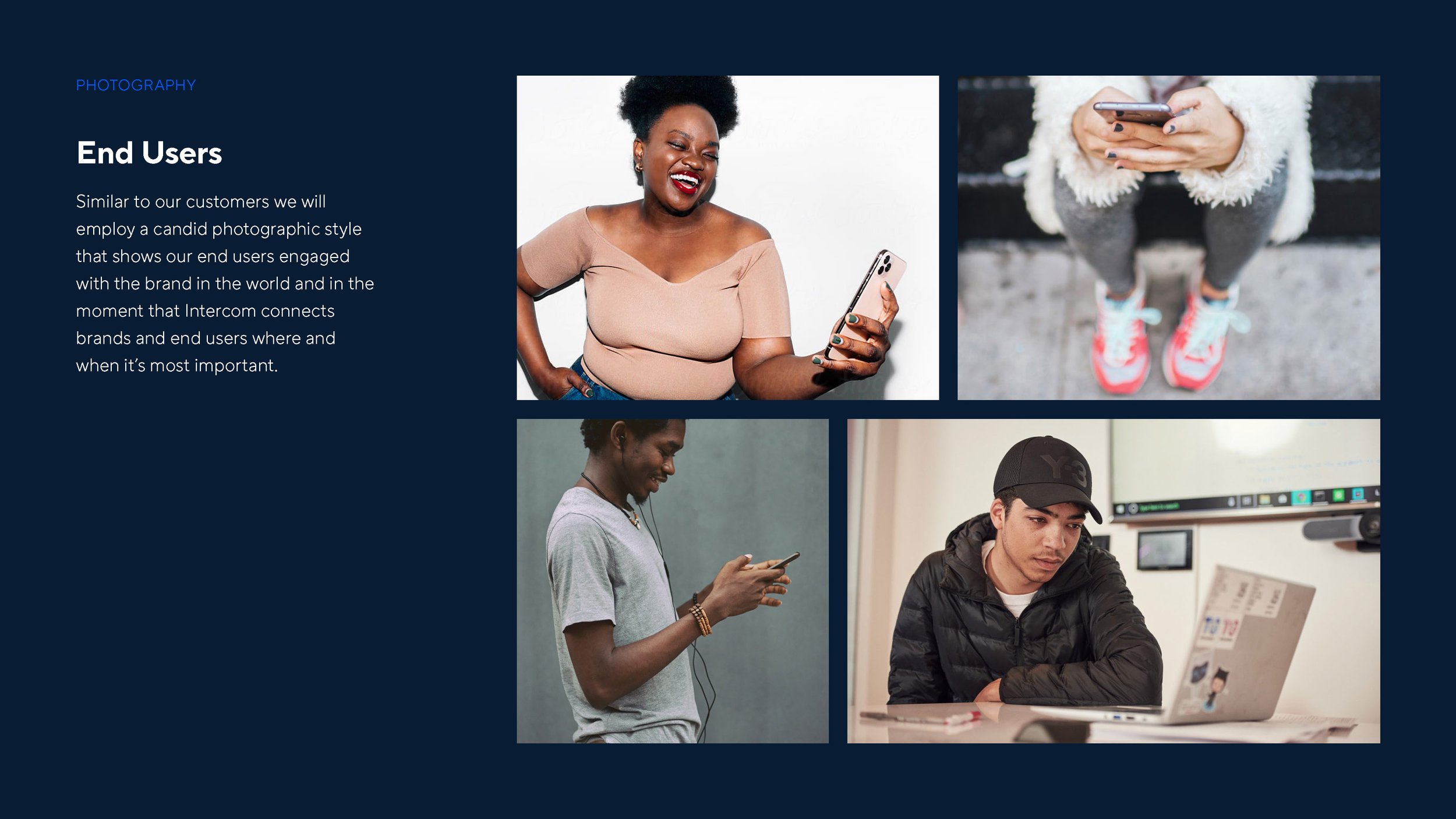
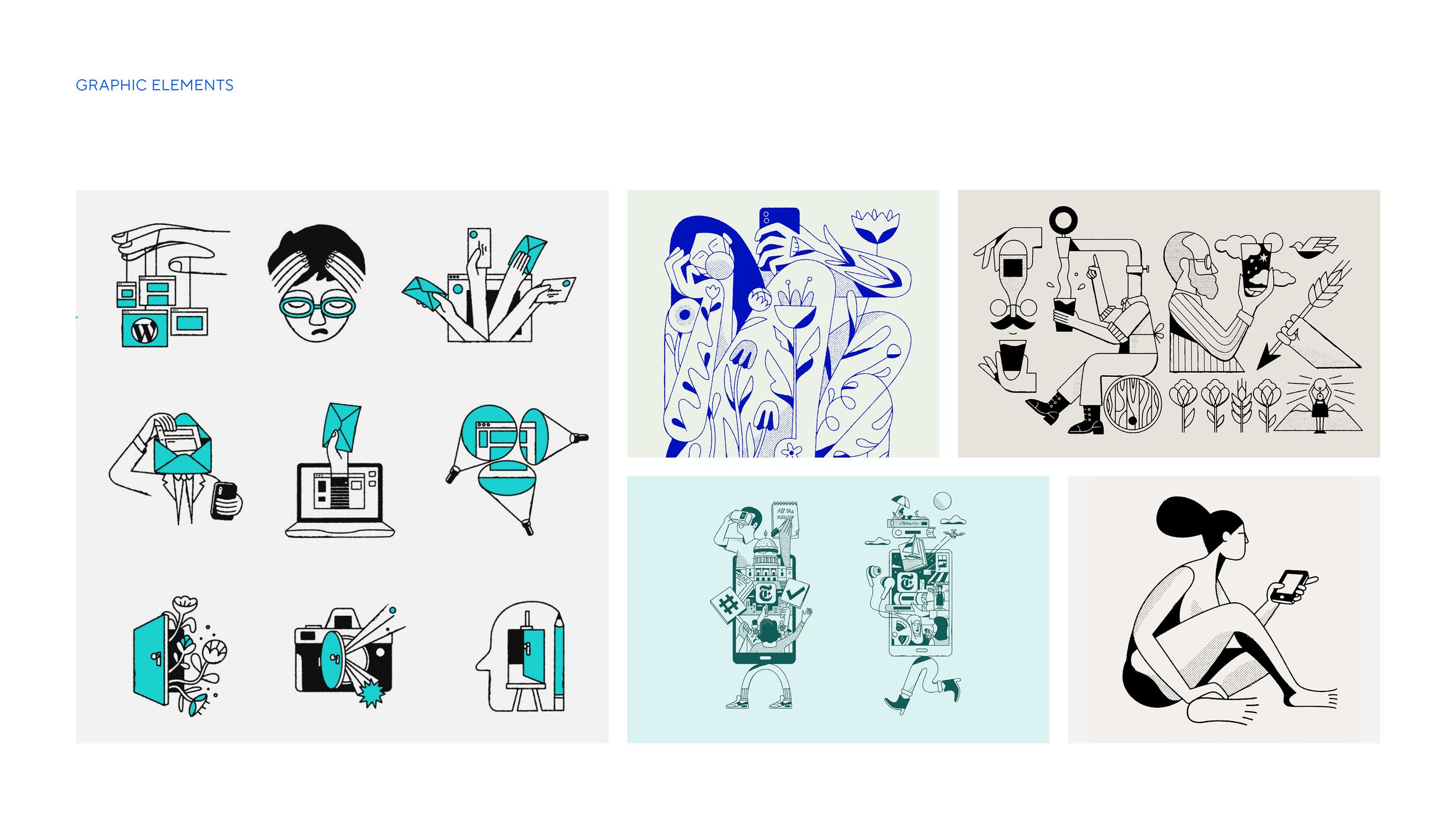
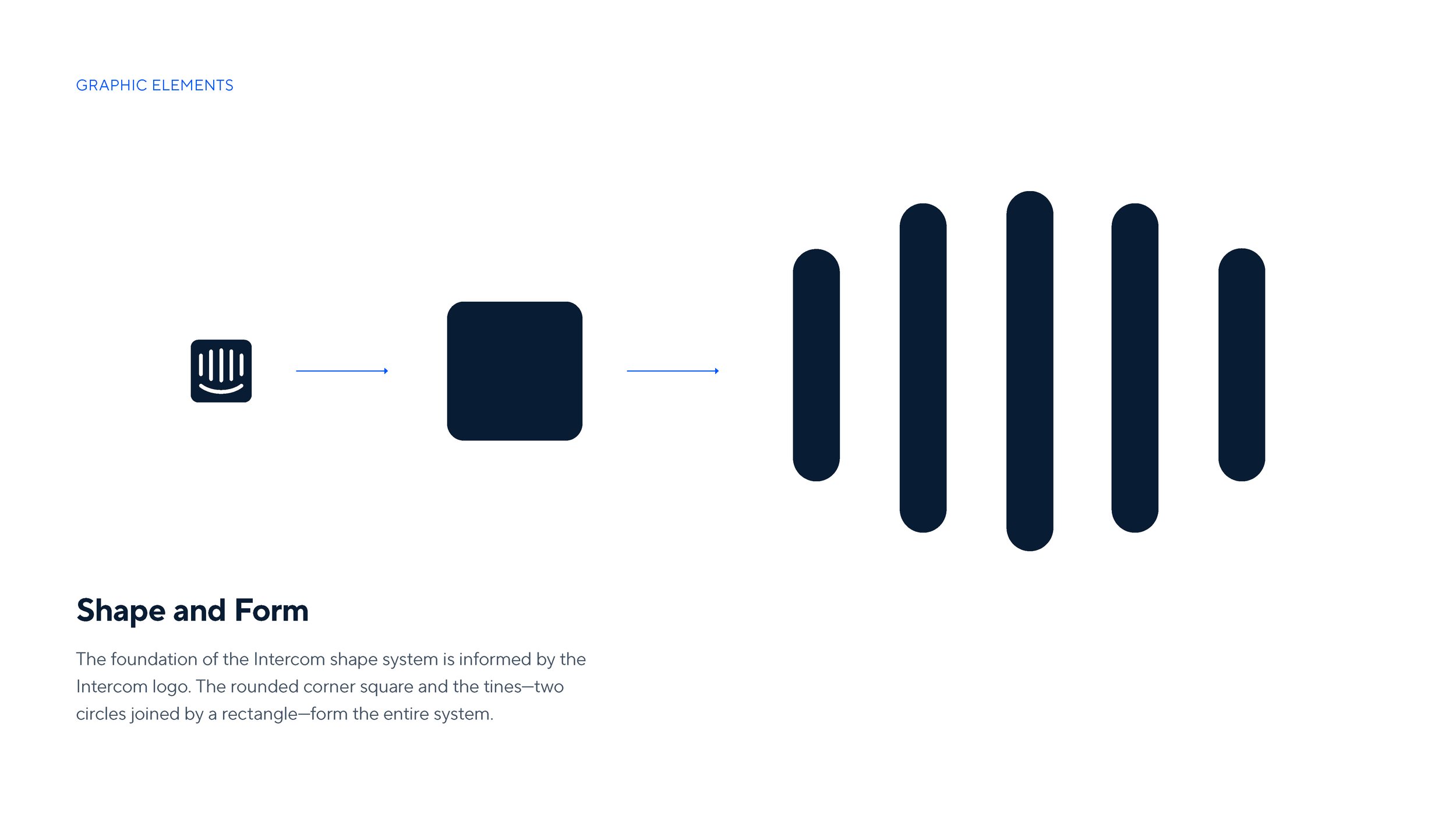
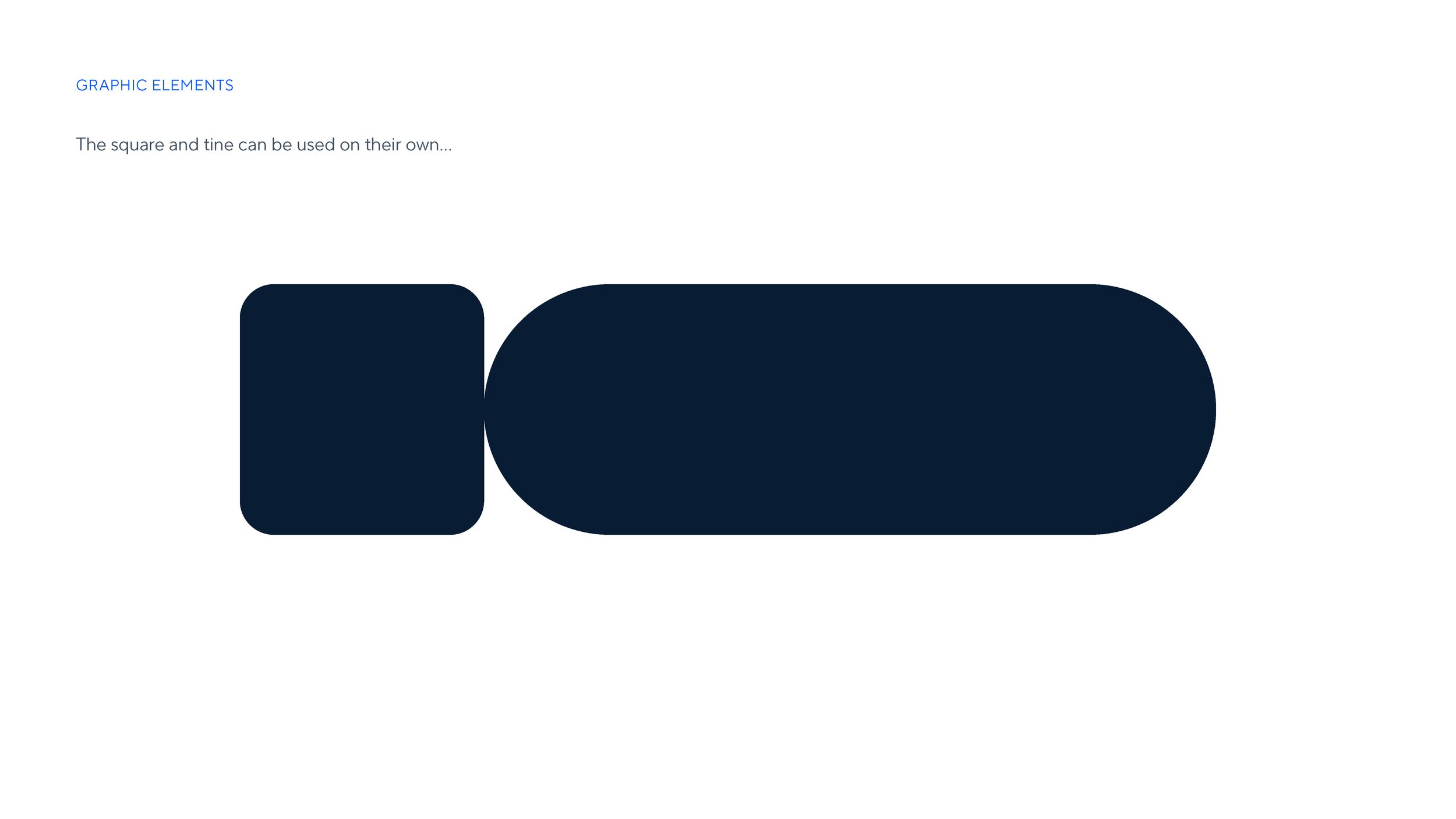
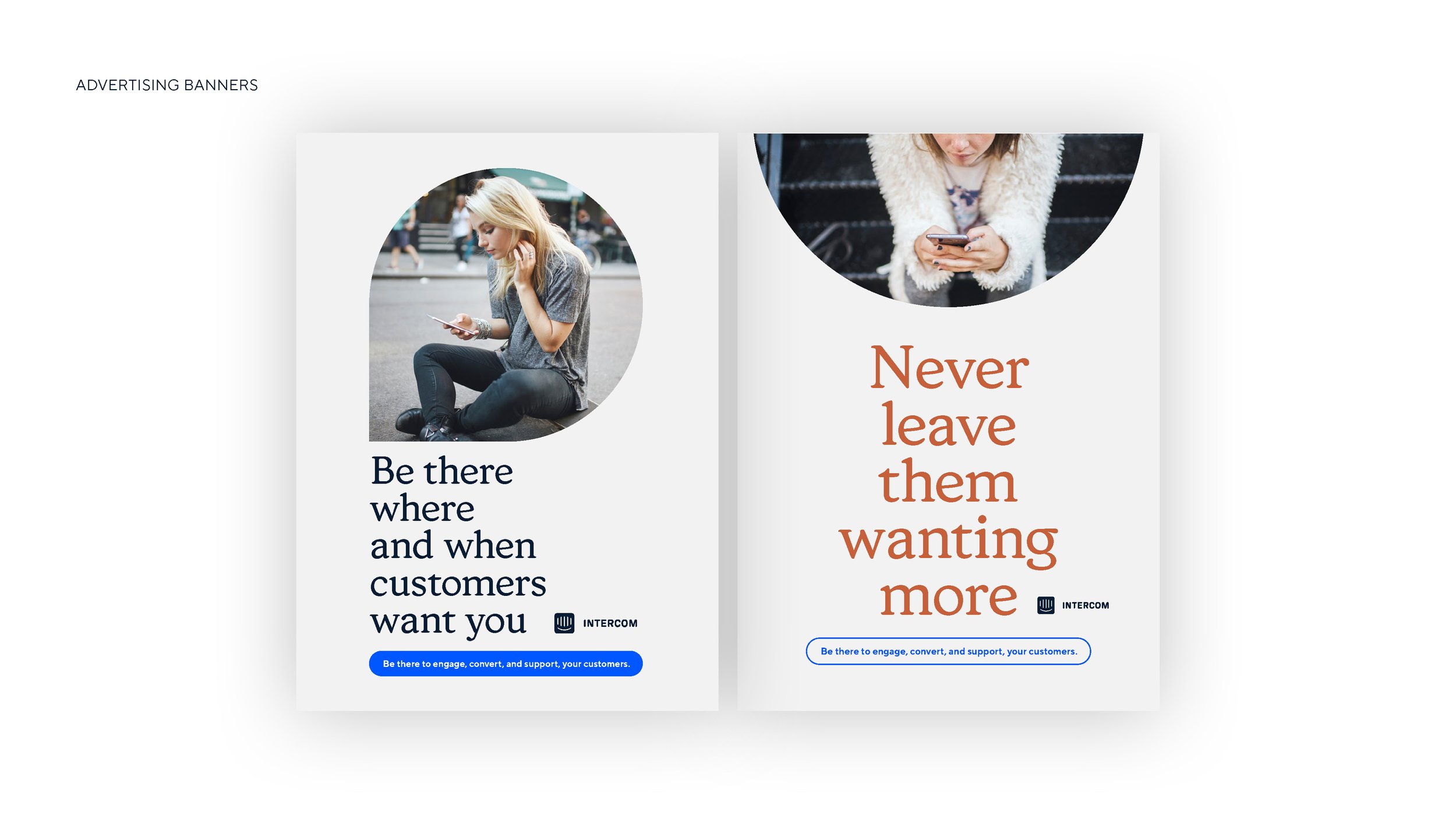
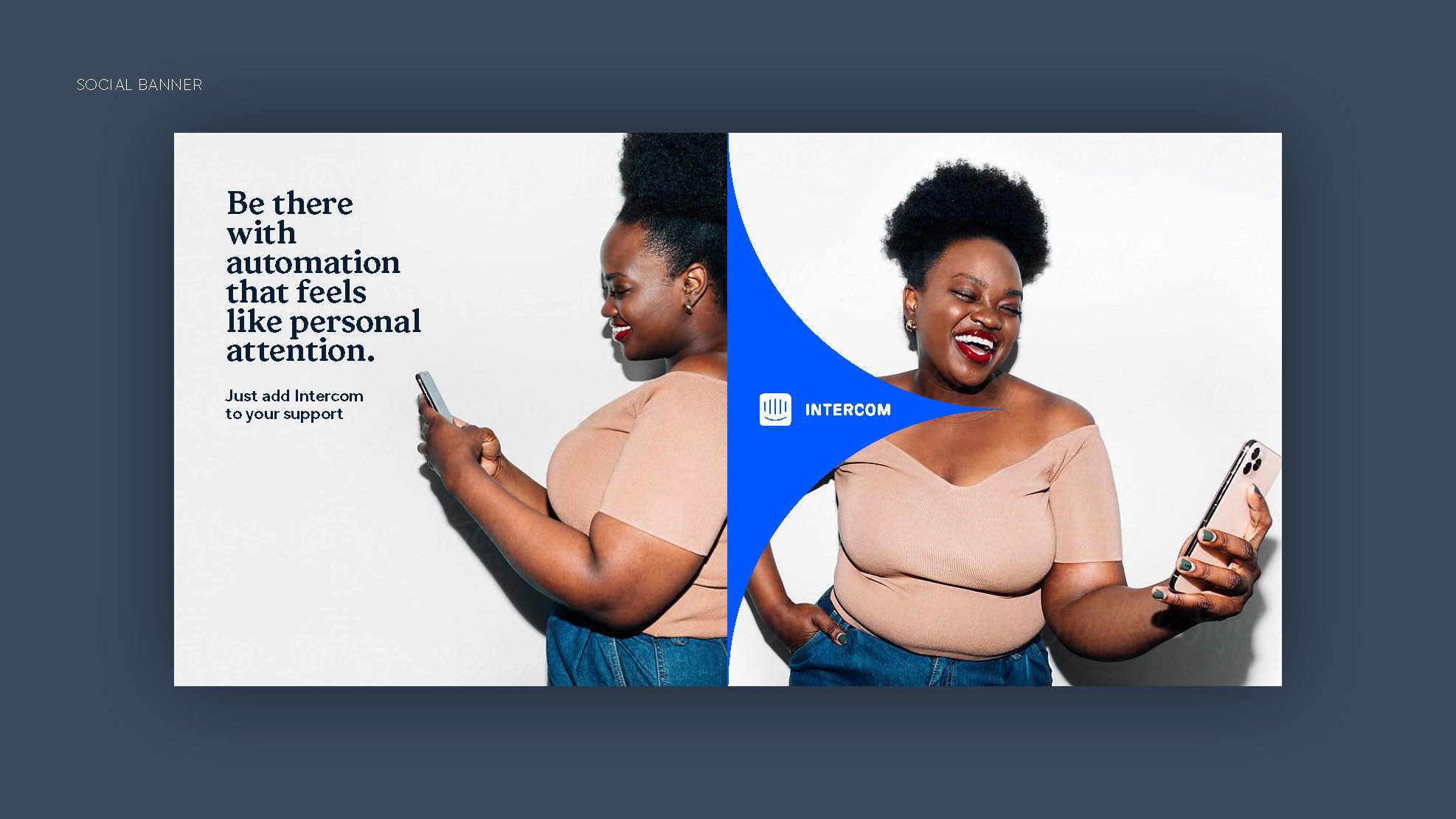
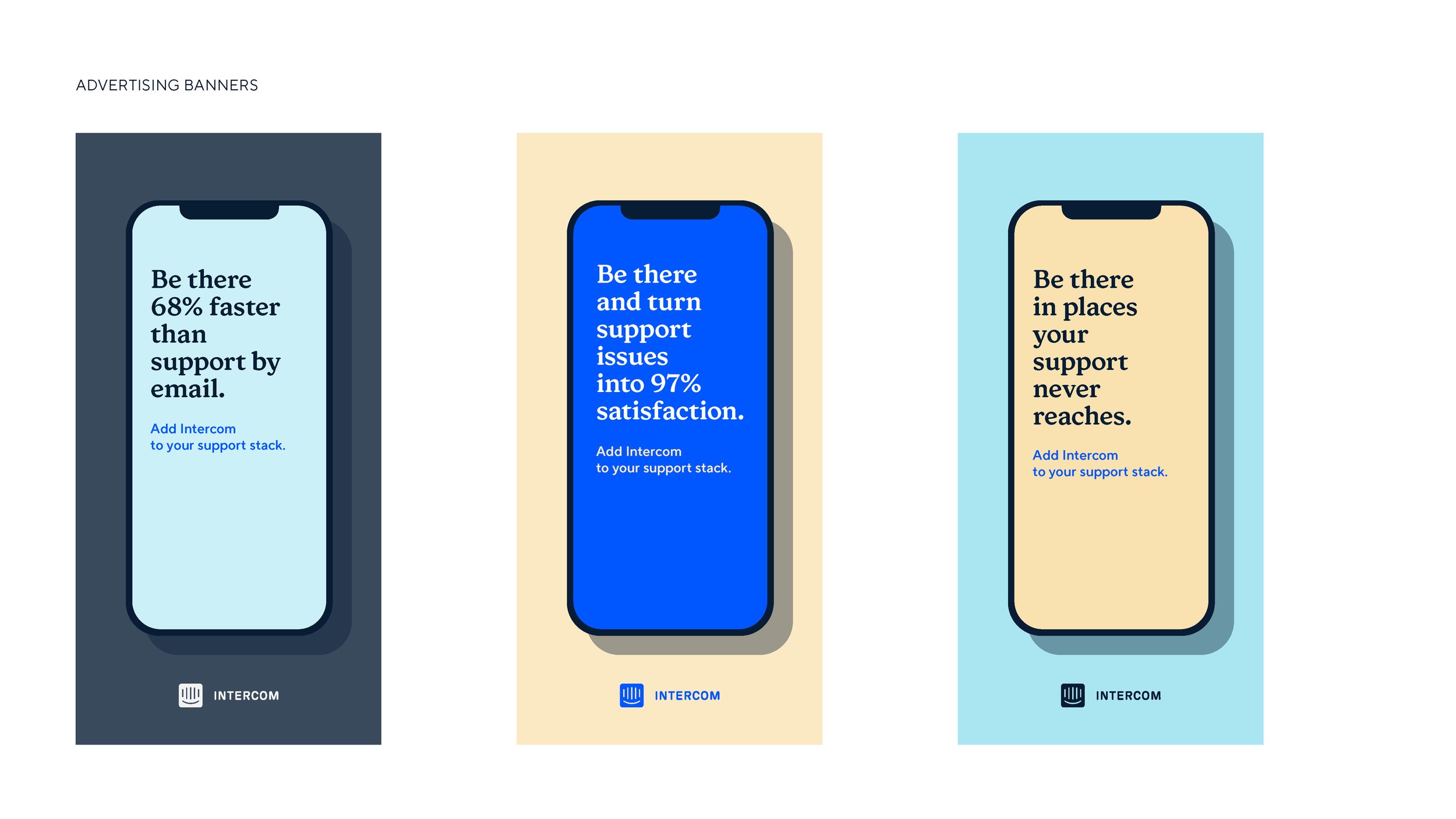
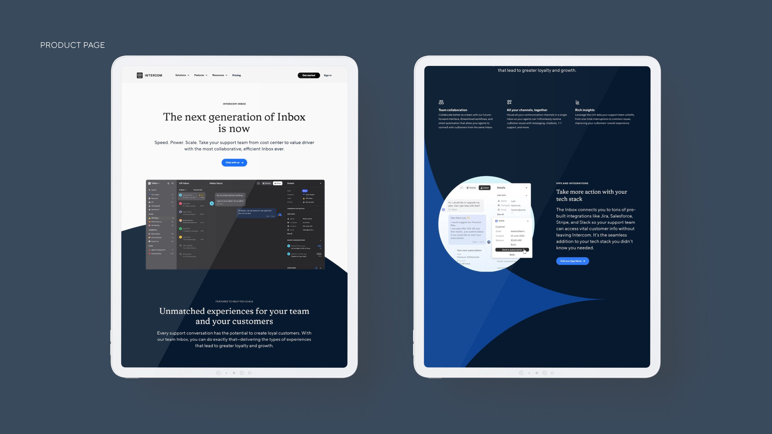
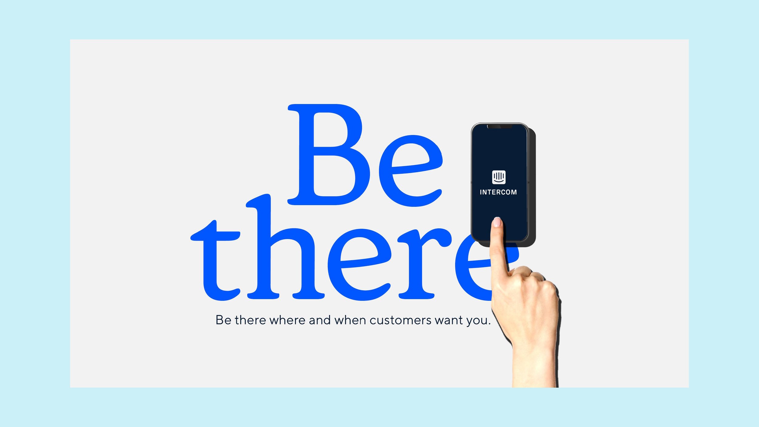
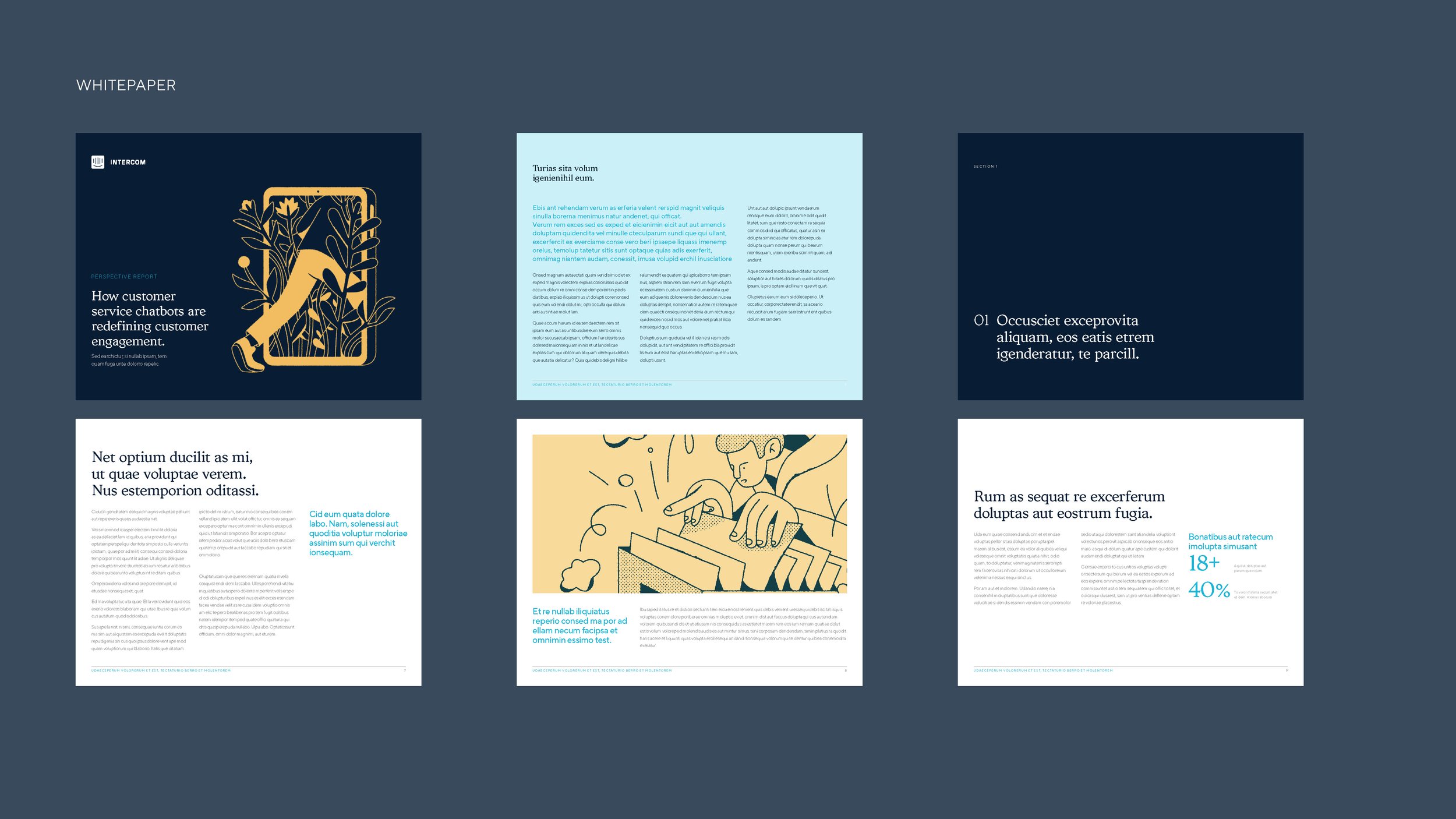
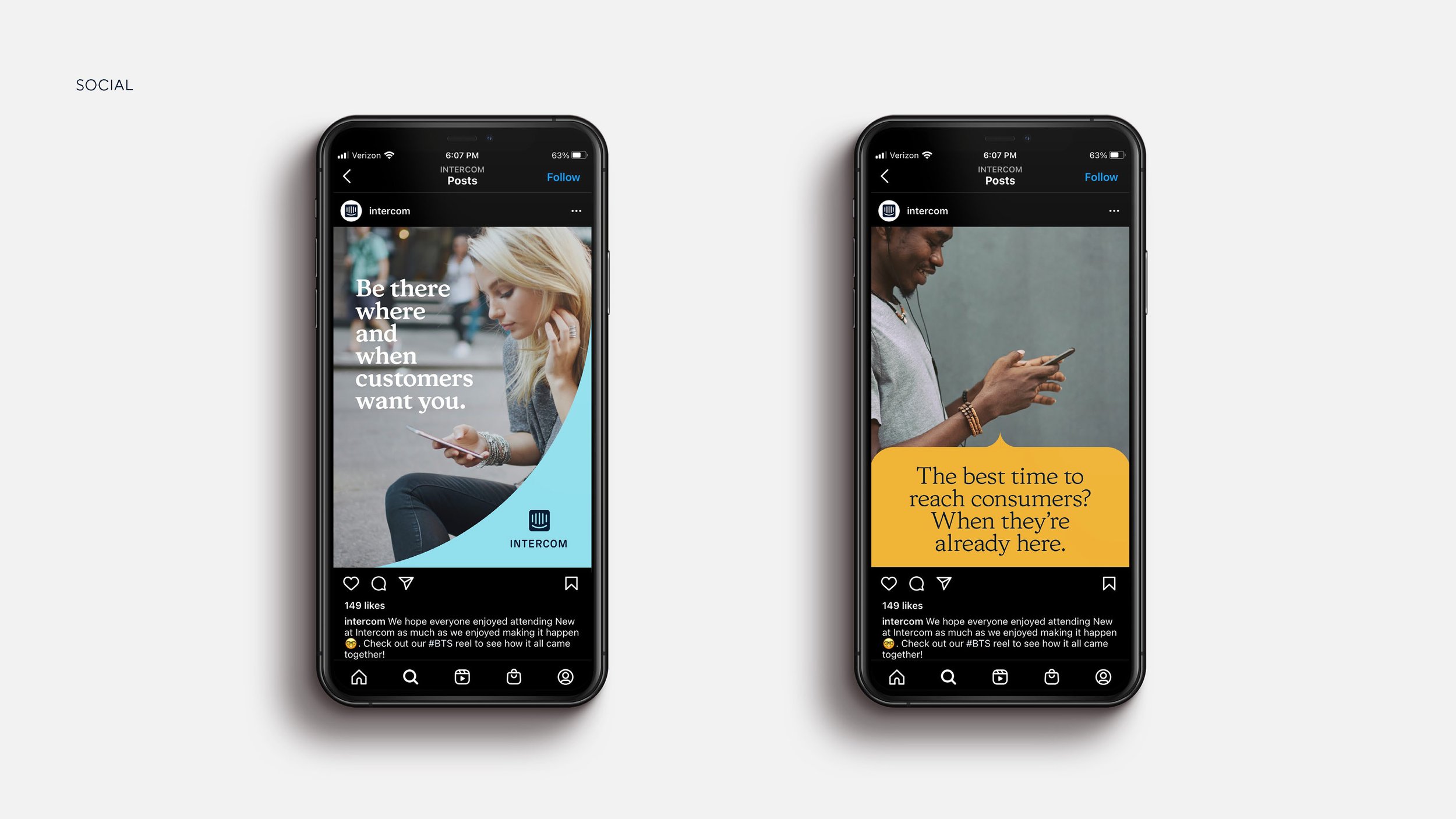
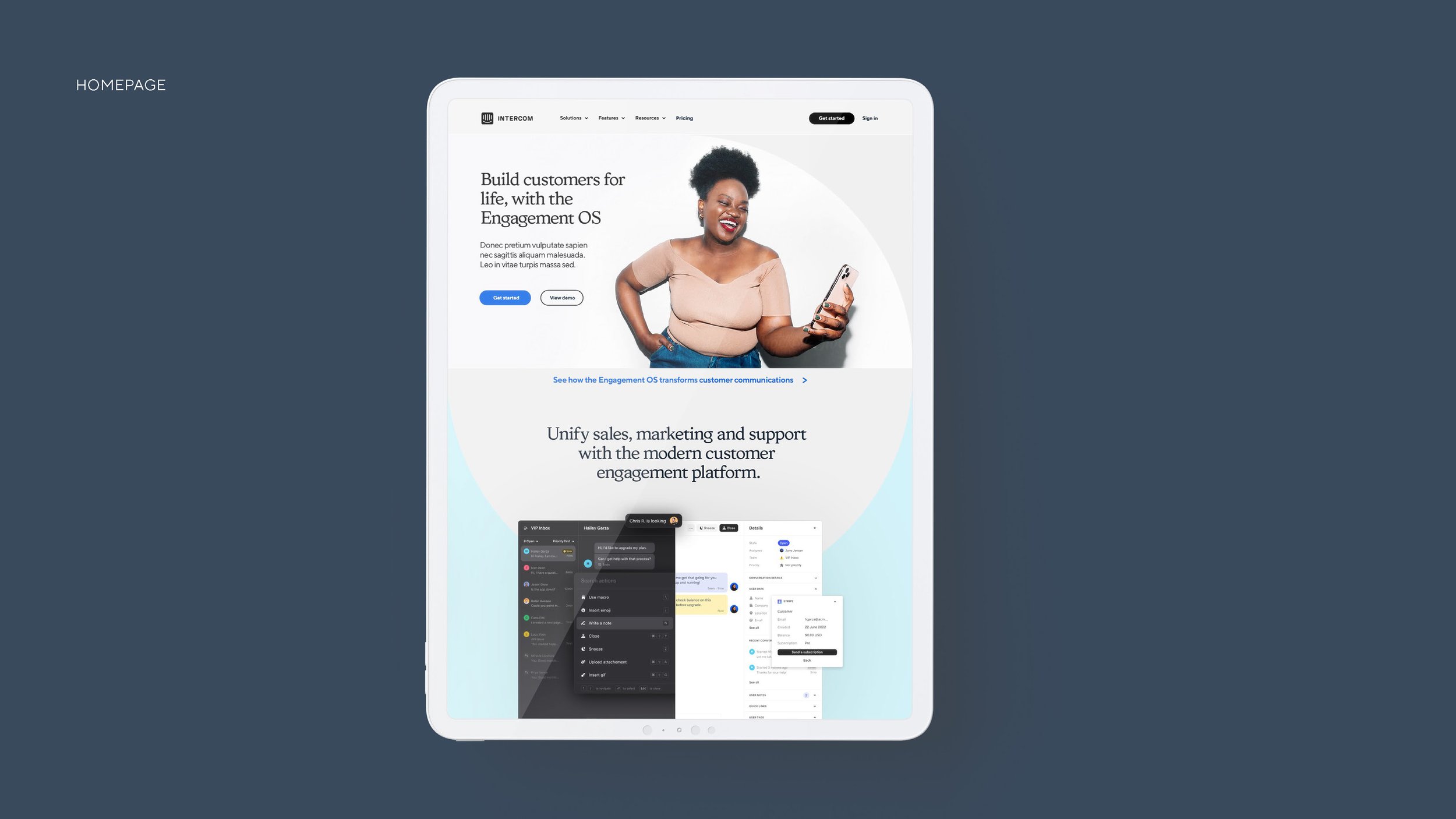
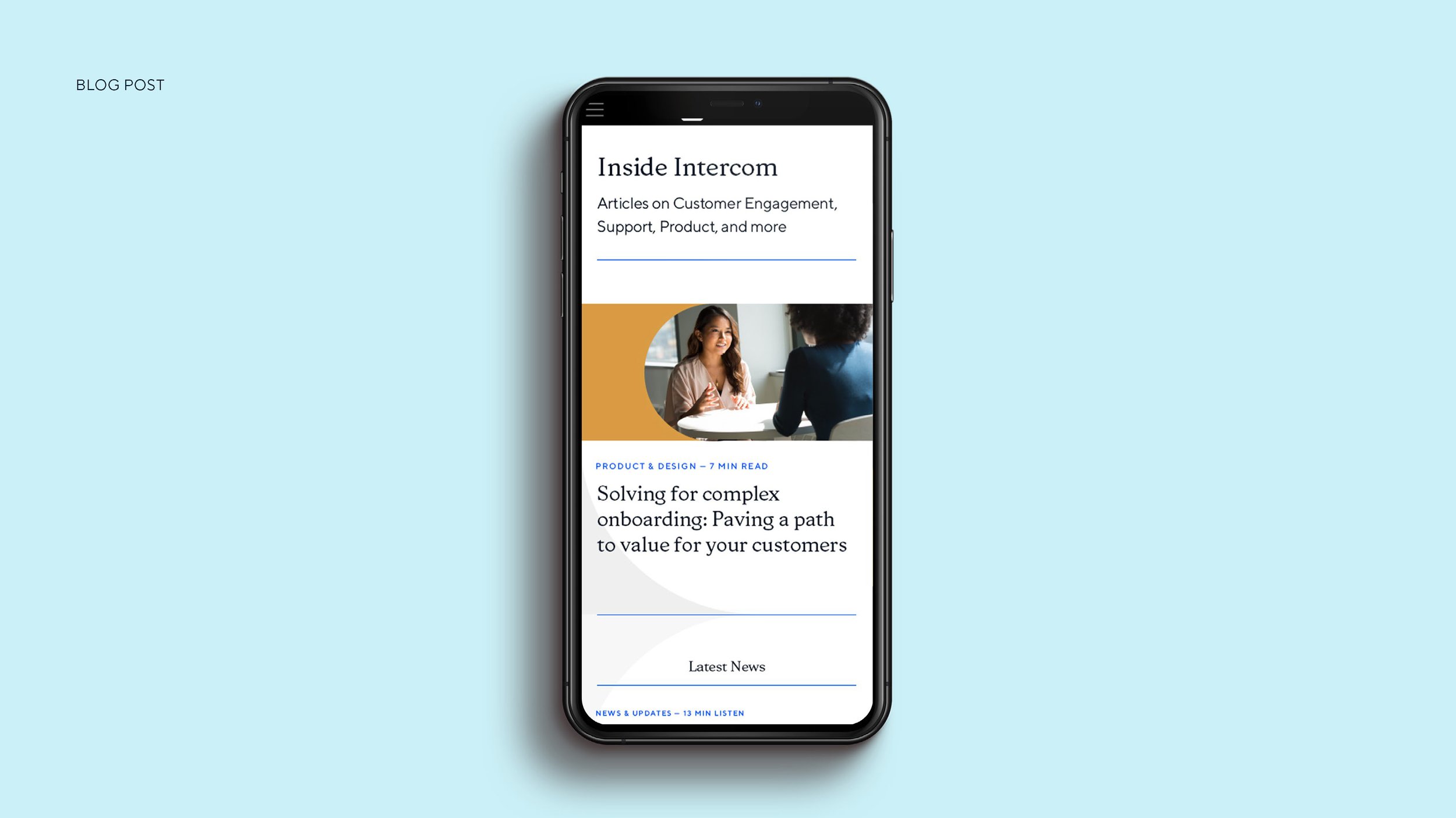
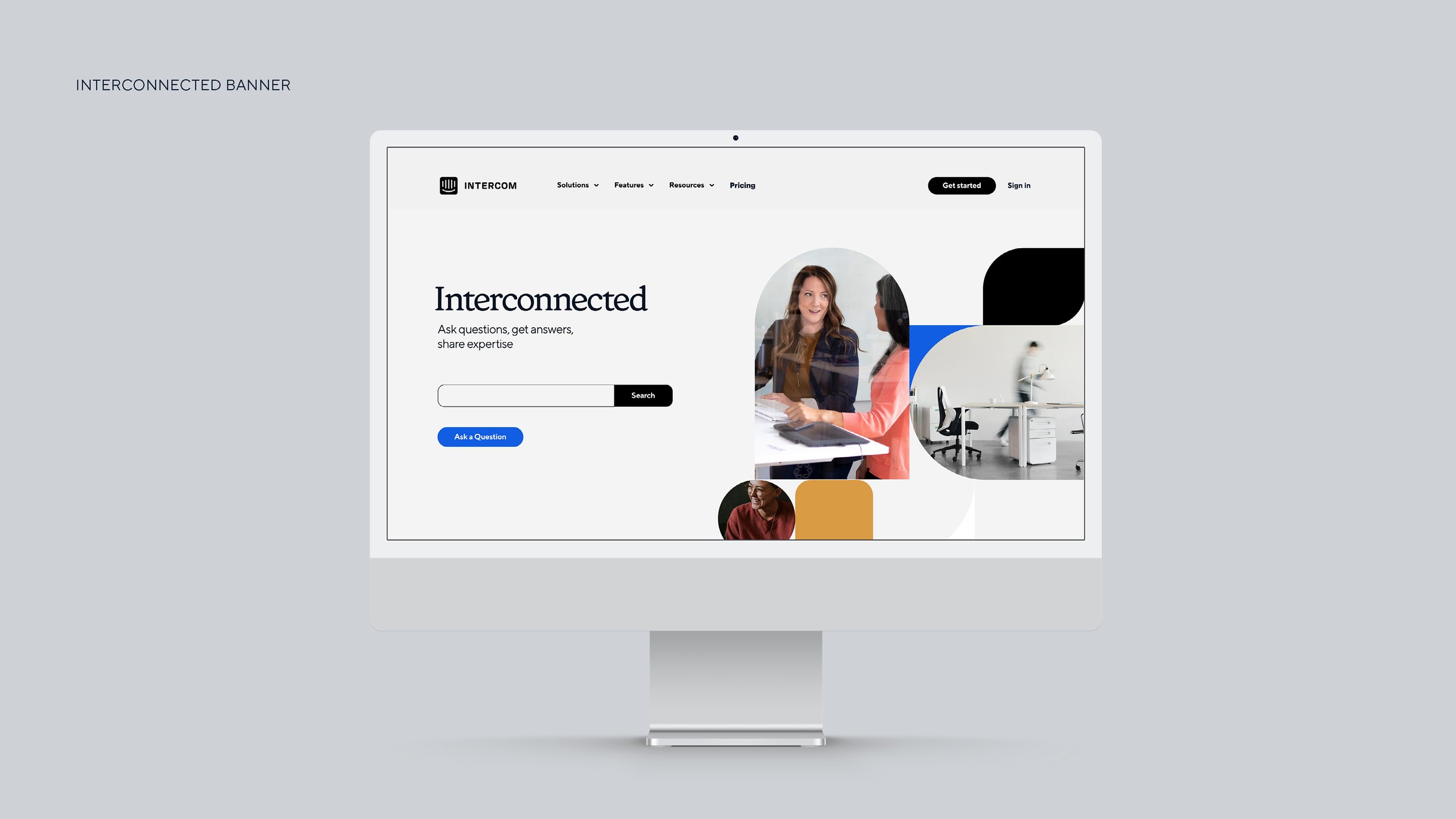
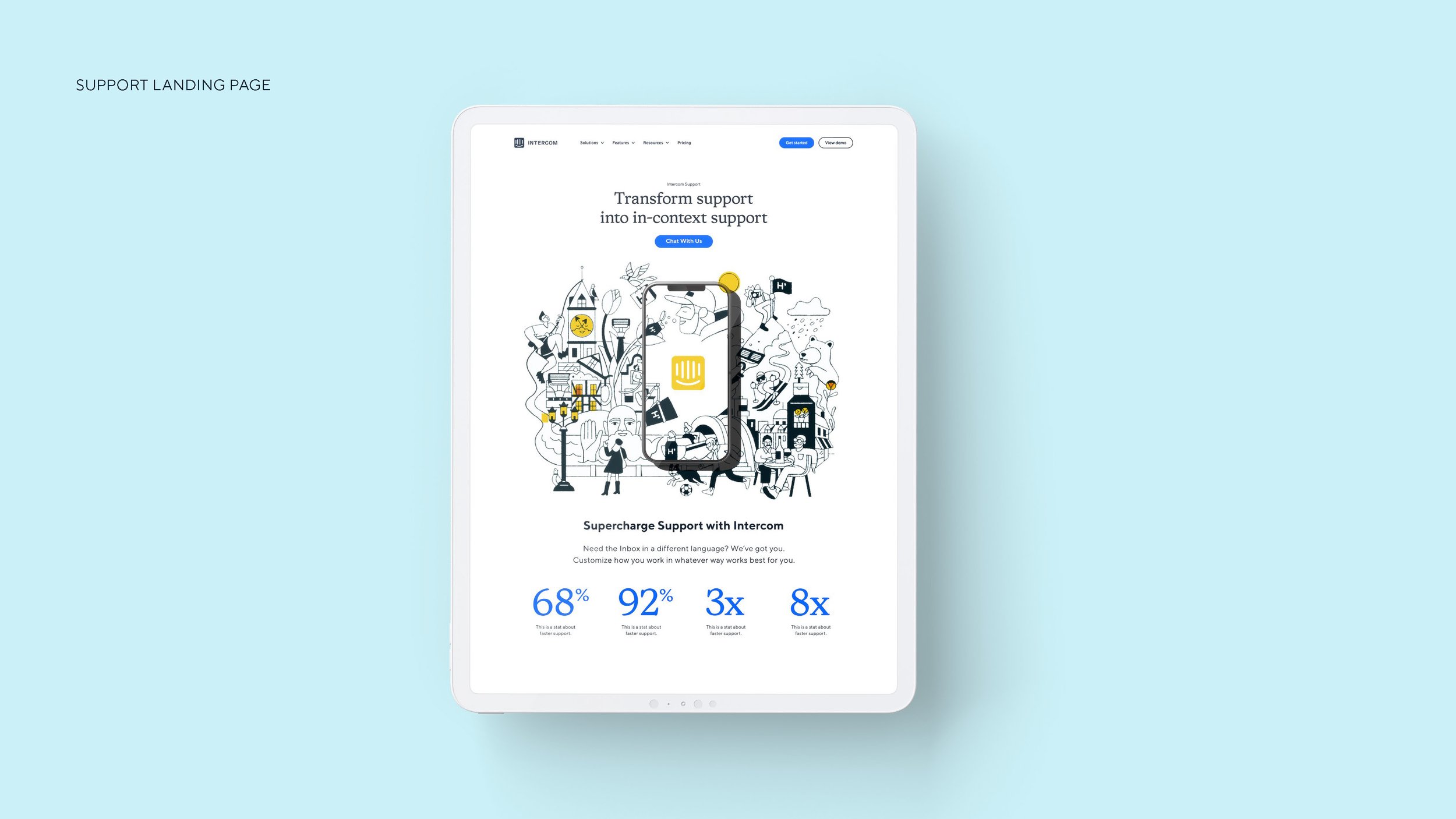
Intercom is an all-in-one customer communications platform that needed a brand refresh. Utilizing the pill box shape of the logo and similar graphic elements that are commonly used in messaging, I worked with Intercom to come up with a design system that can be carried out across the board. A new serif font was added to the brand, the color palette was expanded to include more shades and hues, a more humanistic approach to photography was added to the existing photo library, and new graphic elements were incorporated to elevate Intercom’s brand.
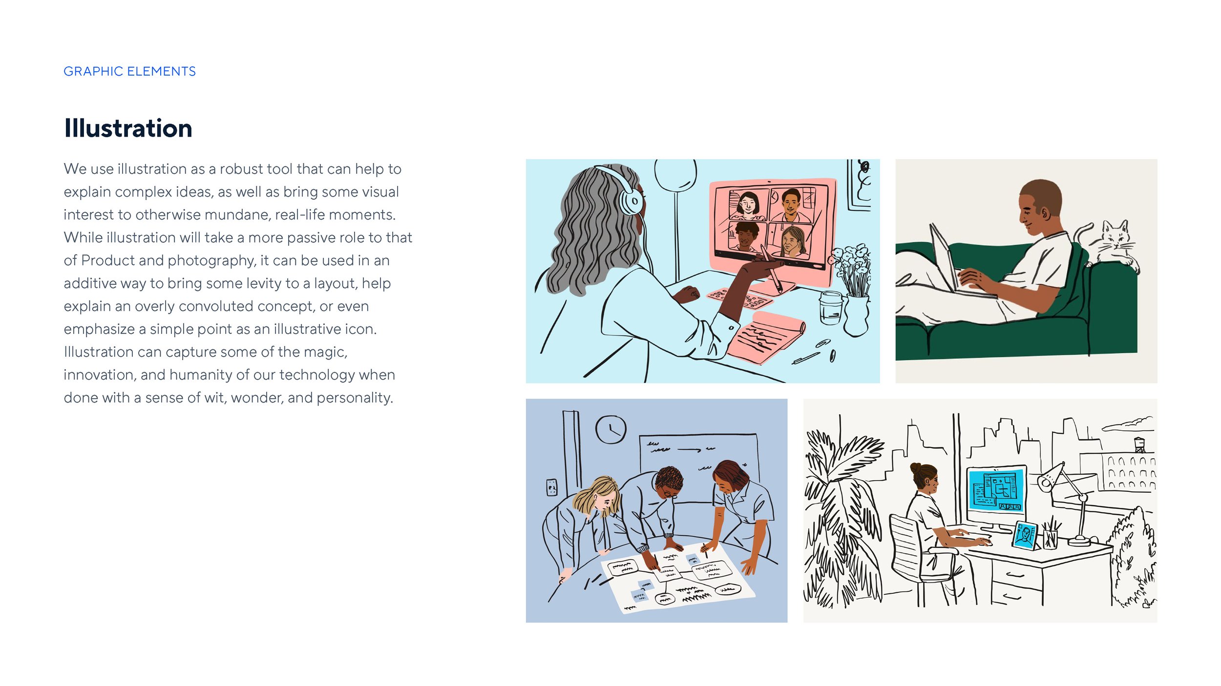
My favorite part was further developing the brand by adding some illustrations that paired perfectly with the rounded shapes and elements. I feel this given the brand a real human touch and sets them apart from their competition.